SPL Online
Fixing the two moments that made people give up: signing in and finding a parcel
Saudi Post’s SPL Online app lost people at two moments: signing in and finding their parcel. We redesigned both around what our interviews and usability tests showed.
Independent UX case study
- My role
- Team leader & UX/UI designer
- Project type
- Independent redesign (not affiliated with SPL)
- Team
- 4 UX/UI designers
- Timeline
- 2026
- Method
- Design Thinking
- Tools
- Figma · FigJam
2.4
App Store rating (Saudi Arabia)
10
interviews + usability tests
20%
signed in with a password
55%
found their shipment details
The challenge
Most people met SPL through a text message with a tracking number. In the app, creating an account, signing in and pasting that number sent them back to SMS or the call centre. Errors didn’t explain the problem, and “My shipments” had no order, date or sender.
My contribution
I led a team of four through the Design Thinking process, from the interview script and usability sessions to synthesis and the decision to focus on two features, and designed alongside the team.
In Crazy 8s, we each sketched sign-up and “My shipments”, then merged the strongest ideas into one direction.
Key insights
We reviewed 6 competitors, then ran 10 interviews and usability tests on the current app.
Signing in was the biggest barrier
Only 20% signed in with a password; the rest used Nafath. “Forgot password” asked for a username people had also forgotten.
Tracking failed at the first step
Pasting the tracking number failed for 6 of 10, and 45% found the “My shipments” labels unclear.
Nafath already had their trust
Every participant used or asked for Nafath. It felt faster and more trustworthy than a password.
UX process
From research to flows
The research and ideation behind the redesign. Select an image to enlarge it.
Affinity map — interview notes grouped by how often they came up, pointing us to sign-in and tracking. User journeys — Mashael and Fahad from needing the service to receiving the parcel, with each pain point turned into an opportunity. Crazy 8s — paper sketches of sign-up and My shipments by each team member (mine are 07–08). We merged the strongest ideas. Task flows — signing in (account, new sign-up or Nafath) and finding a past shipment (received or sent).
Key decisions
01Focus on two features
- User need
- Failures clustered around sign-in and tracking, while tasks like National Address already worked (95% success).
- Design response
- We redesigned only sign-up, sign-in and tracking, guided by our primary persona, Mashael: a first-time user who gives up at the first obstacle.
- Why it matters
- Fixing the moments that ended sessions mattered more than polishing what already worked.
02National ID instead of a username
- User need
- People forgot their usernames, and the rules appeared only after an error.
- Design response
- Use the national ID, entered in digit boxes, and show password rules from the start.
- Why it matters
- Nothing to remember, and errors are prevented rather than explained.
03Shipments you can scan at a glance
- User need
- People opened shipments one by one to find a date or sender.
- Design response
- A paste button, two tabs (received / sent), a date filter and clear status cards.
- Why it matters
- “Where is my parcel?” gets answered without calling customer service.
Before and after, screen by screen
Each pair shows the current app (A) next to our redesign (B).
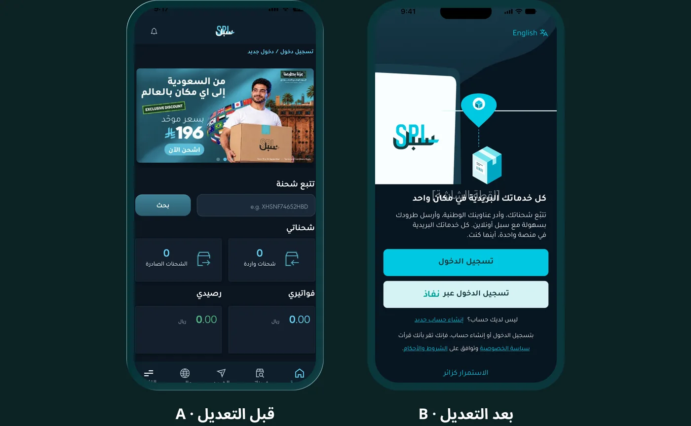
Onboarding — A: the app opens into a busy home. B: a short welcome that explains what SPL offers, with sign-in and Nafath as clear choices.
Outcome
- A research-backed redesign of sign-up and tracking, with before-and-after screens ready for A/B testing.
- Two personas, journey maps, an affinity map and task flows for both features.
Next project
Dhiyaa